The real problem: you’re not controlling the decision
Here’s what’s actually happening when a guest opens your QR menu:
They don’t read everything
They don’t compare rationally
They don’t evaluate all options
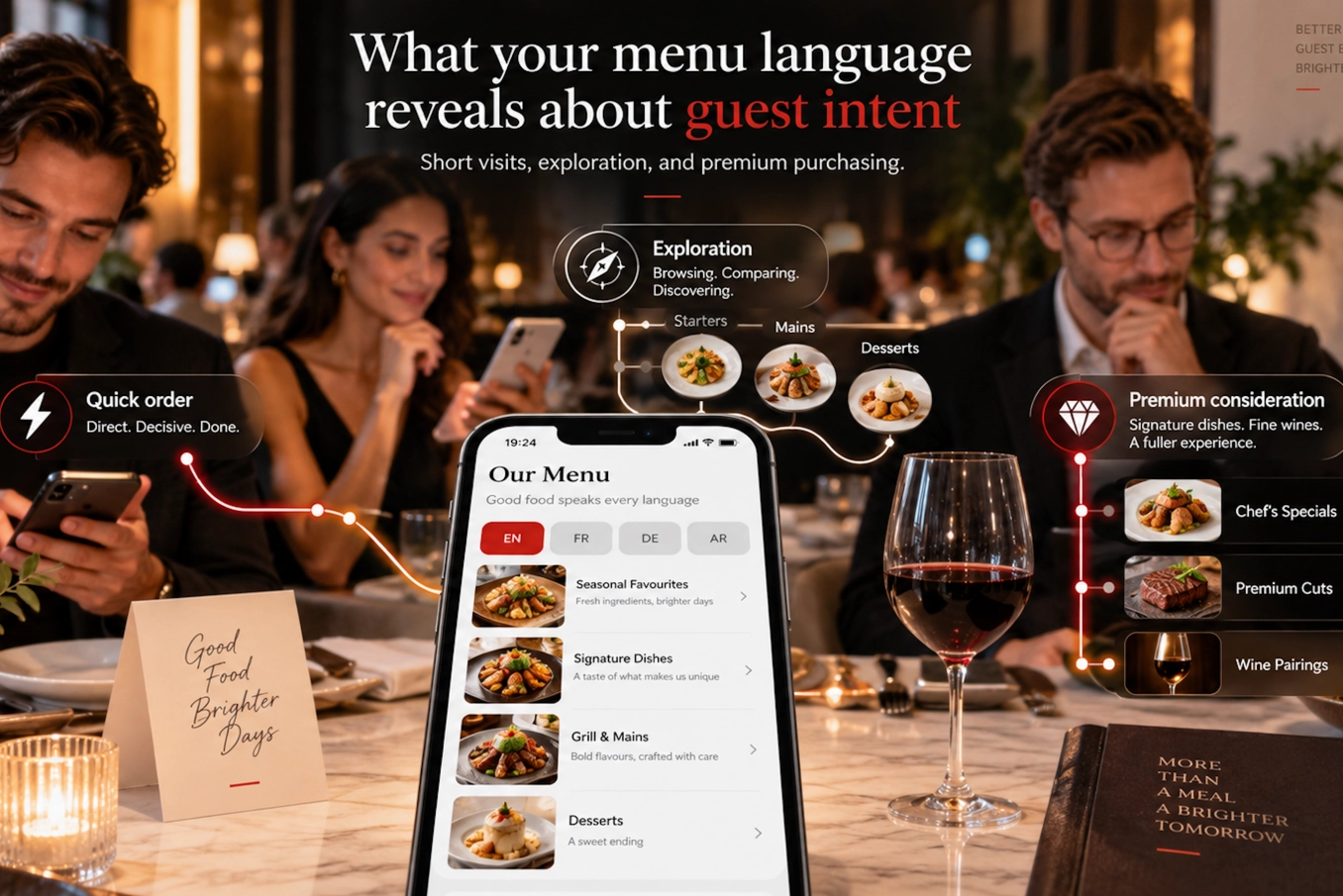
Instead, they scan. They hesitate. They simplify.
This is well documented in Behavioral Economics and Cognitive Psychology.
People are wired to:
Avoid effort
Reduce complexity
Choose what feels easy and safe
So if your menu is neutral, unstructured, or overloaded…
you’re leaving the final decision to chance.
What we see in real restaurants (Oto client data)
Across restaurants using Oto, the same patterns repeat:
Guests open 12–15 dishes before deciding
They spend around 2 minutes on the menu
The first items they see get over 60% of attention
Dishes with photos get 2–3x more engagement
This is not about taste.
This is about attention.
And attention can be engineered.
The psychology behind a high-performing QR menu
Let’s break it down without theory overload. Just what matters in practice.
1. First seen = most likely chosen
The Primacy Effect is simple:
People remember and choose what they see first.
In a QR menu, this effect is even stronger because scrolling adds friction.
What this means for your menu:
Top = premium or best-selling items
Not “Starters” by default
Not random order
Your first screen is your most valuable real estate.
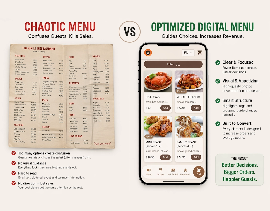
2. Too many options = fewer orders
The Paradox of Choice explains why big menus backfire.
More choice doesn’t mean more sales.
It often means hesitation… or safe, low-value decisions.
We’ve seen menus with:
40 pizzas
25 cocktails
Endless categories
Result? Slower decisions and lower average order value.
Fix it:
6–10 items per category
Clear grouping
Highlight what matters
3. People buy with their eyes first
This one is straightforward.
If there’s no image, the dish barely exists in the guest’s mind.
In real usage:
Dishes with photos get up to 3x more clicks
Guests spend more time on them
They are more likely to be ordered
Translation:
Your menu is not text.
It’s a visual experience.
4. Price is relative, not absolute
The Anchoring Effect shows that people don’t judge prices in isolation.
They compare.
So if the first dish is expensive, everything after feels more reasonable.
Use it intentionally:
Place premium items early
Follow with mid-range options
Guide perception, not just display prices
5. Guests want shortcuts, not decisions
People don’t want to think hard. Especially when hungry.
They rely on shortcuts:
“Best seller”
“Chef’s choice”
“Most ordered”
These cues reduce effort and increase confidence.
And yes, they increase sales.
How to structure your QR menu (practical blueprint)
Now let’s turn all this into something you can actually use.
1. Start with what sells, not with categories
Forget traditional structure.
Instead of:
Starters
Soups
Salads
Start with:
Top-selling dishes
High-margin items
You’re not organizing a kitchen.
You’re guiding a decision.
2. Build strong entry points
Each section should pull attention instantly.
That means:
1–2 strong images
Short, clear dish names
No heavy descriptions
Example:
Instead of:
“Grilled chicken breast with creamy mushroom sauce and herbs”
Write:
Creamy Mushroom Chicken
Faster to read. Easier to choose.
3. Group by how people think
Forget internal logic.
Use categories like:
Popular right now
Quick bites
For sharing
Premium selection
This matches how guests actually decide.
4. Reduce scrolling
Every extra scroll reduces conversion.
So:
Keep lists short
Put key dishes early
Avoid endless categories
If guests need effort, they delay decisions.
5. Highlight with intention
Don’t highlight everything.
Pick:
2–3 dishes per category
Mark them clearly
This creates direction. Not noise.
What changes when you get this right
When restaurants restructure their QR menu using these principles:
Decisions happen faster
Guests choose higher-value items
Average order size increases
Hesitation drops
Because now the menu works with human behavior, not against it.
The Oto solution (where this becomes real)
Understanding psychology is one thing. Applying it daily is another.
With Oto, you don’t guess.
You see:
Which dishes guests open
Where they hesitate
What gets ignored
What drives actual orders
Then you adjust your menu based on real behavior.
Add photos.
Reorder items.
Highlight strategically.
All in minutes.
A paper menu stays static.
An Oto QR menu evolves with your customers.
Try Oto
Your menu is already influencing decisions.
The question is: are you controlling it?
Start optimizing here:
https://otoqr.app/en/register
FAQ
Why does menu structure affect sales so much?
Because guests don’t analyze menus logically. They rely on visual cues, positioning, and shortcuts to decide quickly.
What is the most important part of a QR menu?
The first screen. It captures most of the attention and drives the majority of decisions.
Should I reduce the number of dishes?
Yes. Too many options create hesitation and reduce conversions.
Do “best seller” labels really work?
Yes. They simplify decisions and increase confidence, leading to higher sales.
Can I measure how guests interact with my menu?
Yes. With tools like Oto, you can track behavior, not just orders, and optimize your menu accordingly.