What good digital menu design really means
A digital menu is not just your printed menu uploaded online.
It’s a sales tool.
A well-designed QR menu should:
Load instantly
Be readable without zoom
Guide the guest toward high-margin items
Make ordering feel effortless
If any of these break, your revenue leaks. Simple as that.
1. Speed is everything
Guests give you maybe 3–5 seconds. That’s it.
If your menu:
loads slowly
shows a blank screen
requires multiple redirects
…they check out mentally.
What to do instead:
Use lightweight pages, not heavy PDFs
Optimize images (no 5MB food photos)
Avoid unnecessary scripts and pop-ups
Fast menu = more orders. Always.
2. Never use PDFs as your main menu
PDF menus are the #1 mistake.
They were not made for phones. Period.
Problems:
Constant zooming
Hard to navigate
No interaction
No upselling
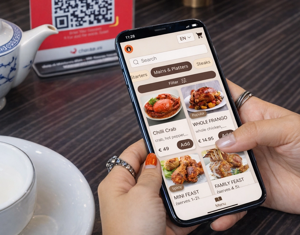
Instead, use a mobile-optimized layout where:
Categories are clearly separated
Items are easy to scan
One thumb is enough to navigate
Think Instagram, not a Word document.
3. No apps. Ever.
If your menu requires downloading an app, you’re creating friction for no reason.
Let’s be honest:
Nobody wants to install an app just to order a pizza.
Every extra step kills conversion.
Rule:
Scan → menu opens → done.
Anything more than that, and you’re losing people.
4. Design for how people actually read menus
Guests don’t read menus. They scan them.
Your job is to guide their eyes.
Use:
Short, punchy descriptions
Visual separators between categories
“Best seller” or “Chef’s choice” tags
Strategic placement of high-margin dishes
A good menu doesn’t just show food. It nudges decisions.
5. Use photos, but don’t overdo it
Photos sell. But too many photos slow everything down.
Balance is key:
Add images to top-selling dishes
Keep style consistent
Avoid low-quality or stock photos
One great image is better than ten average ones.
6. Make it multilingual without friction
If you rely on tourists, this is non-negotiable.
But don’t:
Redirect users to different links
Force manual switching through complicated menus
Instead:
Detect language automatically or keep a simple toggle
Keep structure identical across languages
The experience should feel seamless, not like switching websites.
7. Keep it clean. Always.
Clutter kills appetite.
Avoid:
Long paragraphs
Too many fonts
Overloaded screens
Stick to:
Clear typography
Plenty of spacing
Logical flow
If a guest feels overwhelmed, they order less. Or nothing.
8. Think like a salesperson, not a designer
This is where most restaurants get it wrong.
A menu is not just about looking good.
It should:
Push profitable dishes
Highlight combos
Encourage add-ons
Example:
Instead of just listing “Burger – €8”
Say: “Juicy beef burger with melted cheddar. Try it with fries + drink for €11.”
That small change increases average order value without extra effort.
Turn your menu into a revenue tool
Most restaurants don’t have a menu problem. They have a conversion problem.
Slow loading, PDFs, bad structure. All of that quietly reduces how much each table spends.
With Oto, you can:
Create a fast, mobile-first digital menu
Highlight bestsellers and high-margin dishes
Instantly translate your menu into multiple languages
Update everything in minutes, not days
And the best part: your guests just scan and order. No friction.
👉 Start here: https://otoqr.app/en/register
Want to go deeper?
If you’re serious about turning your menu into a revenue engine, read this next:
How QR Menus Increase Restaurant Revenue (Without Hiring More Staff)
This is where design meets real business impact.
Final thought
Your digital menu is often the first real interaction a guest has with your restaurant.
Not your interior. Not your staff. The menu.
If it’s slow, clunky, or frustrating, you’re sending the wrong signal before the first bite.
Fix the experience, and the numbers will follow.
FAQ
What is the biggest mistake in digital menu design?
Using PDFs instead of mobile-optimized menus. They create friction and reduce ordering.
How fast should a QR menu load?
Ideally under 2–3 seconds. Anything slower starts losing guest attention.
Do QR menus really increase revenue?
Yes, when designed properly. They guide choices, highlight profitable items, and reduce ordering friction.
Should every dish have a photo?
No. Focus on bestsellers and high-margin items to keep performance fast and design clean.
Is it worth investing in a custom digital menu?
Absolutely. A well-designed menu directly impacts order size and overall guest experience.